Brightline High Speed Rail Roars Into Orlando
SOURCE ARTICLE: https://www.orlandomagazine.com
“Brightline High Speed Rail Roars Into Orlando”
A beacon of progress for Floridians, a boon for Orlando. Brightline comes to town
August 2, 2023 / Catherine Walters


Photos by Emily Jourdan
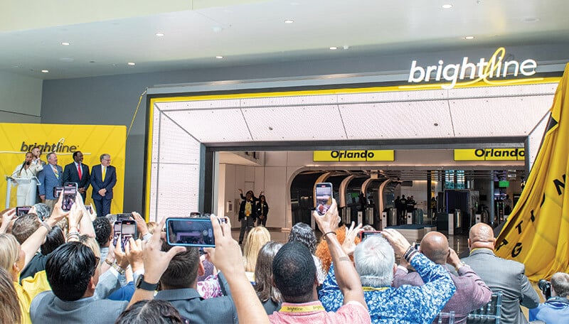
Brightline’s unveiling ceremony welcomed Orlando leaders and media to an up-close look at the new station and amenities.
Brightline, the pioneering provider of eco-conscious, modern intercity rail service in America, has recently unveiled its highly anticipated Brightline Orlando Station at the Orlando International Airport (MCO). This event marked a pivotal moment not only for Brightline, but also for American transportation as a whole. Undoubtedly, Florida residents, especially those in Orlando, stand to benefit immensely from the advantages this type of transportation offers.
The new Brightline Orlando Station serves as an epitome of 21st-century passenger rail travel. Sporting Brightline’s signature yellow hues and spacious lounges, the station introduces an era of enhanced connectivity for the rapidly expanding regions of Central and South Florida. The station boasts a meticulous design, crafted with the modern traveler in mind, offering a blend of efficiency, convenience, and comfort.
The unveiling of the Brightline Orlando Station was met with applause from elected officials, dignitaries, and community leaders alike, signaling the station’s transformative potential for Florida’s transportation landscape. The station, located at the heart of one of America’s busiest airports, stands as a testament to the union of innovation and practicality.
The Experience
Experiencing the new station goes beyond traditional transportation services. Brightline offers a holistic, immersive journey for its passengers, starting the moment they step into the main entrance. The station’s features include a wide array of amenities, such as the Mary Mary Bar with its hand-crafted cocktails, the retail experience at MRKT PLACE, and BrightKids, a dedicated children’s play area.
Moreover, Brightline differentiates its service offerings into SMART and PREMIUM categories. The PREMIUM service provides additional perks like complimentary meals, a dedicated first-class lounge, free checked luggage, priority boarding, and a dedicated coach. Throughout the station, passengers can also enjoy free high-speed Wi-Fi, multiple charging stations, and numerous big screen televisions.
The Orlando to South Florida train schedule from Brightline presents an ambitious transportation plan, providing 16 daily round trips with hourly departures between Miami and Orlando. This service ensures seamless mobility for millions of riders between Central and South Florida.
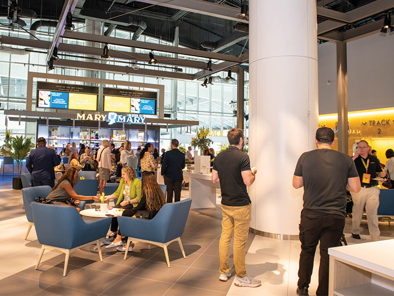


Travelers enjoy the Mary Mary Bar’s modern and open atmosphere.
Brightline’s Orlando expansion embodies a bold, private infrastructure project that is set to revolutionize Florida’s intercity connectivity. The service, slated to begin September 1, promises to deliver expedited travel times and widespread access to major Florida cities.
The design of the Brightline Orlando Station was entrusted to Bigtime Design Studios, a Miami-based architecture firm that has previously designed other Brightline stations. The buildout was managed by Gomez Construction Co., an Orlando-based, minority-owned business.
In tandem with this groundbreaking expansion, Brightline has made significant strides elsewhere too. Earlier this year, Brightline achieved the feat of becoming the fastest train in the Southeast, clocking speeds of 130 mph. It also unveiled Basecamp, the most advanced train maintenance facility in the country.
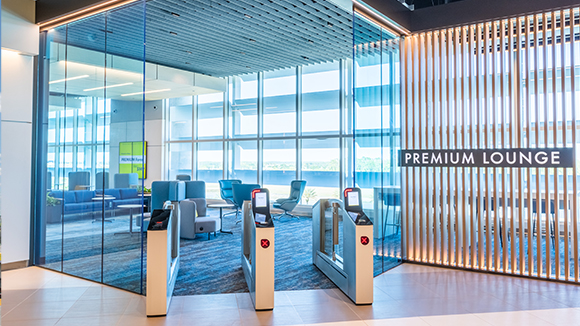


Passengers booking Premium tickets have access to the Premium Lounge, complimentary snacks and beverages, priority boarding, and more.
Orlando Mayor Buddy Dyer praised the station’s unveiling, highlighting its importance as a critical connection for the community to jobs and opportunities. Orange County Mayor Jerry Demings echoed the sentiment, emphasizing the transformative economic impact the Brightline Orlando Station will have on the region.
With the advent of Brightline’s rail service at Orlando International Airport, passenger mobility between two of Florida’s busiest regions is set to improve drastically. Kevin Thibault, CEO of the Greater Orlando Aviation Authority, highlighted the significance of this advancement, acknowledging Orlando International’s unique status as the only airport in the nation with an intercity high-speed passenger rail station.
Transforming Florida’s Mobility Landscape
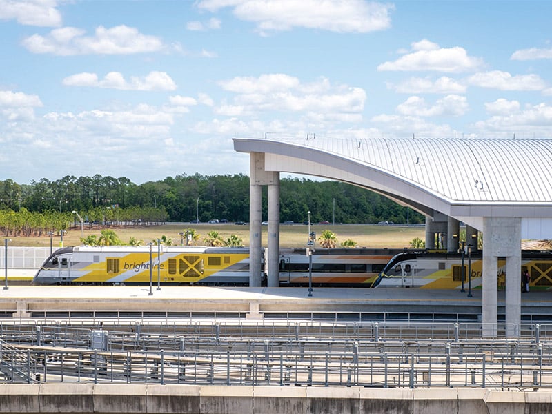


Designed by Bigtime Design Studios, the new Brightline Orlando Station boasts, bold, modern architecture.
The Brightline Orlando Station marks a significant shift in the transportation landscape of Florida, particularly for the city of Orlando. With its modern design and comprehensive list of amenities, the station signifies the onset of a novel, refined travel experience for Floridians.
Brightline’s commitment to offering a cutting-edge travel experience reflects in its meticulously designed stations and services. The stations are crafted to facilitate seamless movement while embodying the contemporary aesthetics preferred by today’s travelers. The 37,350 square-foot Orlando station, housed within the Orlando International Airport’s 80,000 square-foot Train Station facility, sets new standards in infrastructure design and traveler convenience.
The state-of-the-art facility connects directly to the airport’s Parking Garage C, which accommodates over 350 parking spaces for Brightline guests. This integration ensures that travelers can transition smoothly from their vehicles to the train, further enhancing the ease of their journey.
Moreover, Brightline introduces a crucial element of modern urban infrastructure – multimodal transportation. Its Orlando station provides direct access to the other airport terminals A and B via the airport’s automated people mover, Terminal Link. This means that travelers can now enjoy a seamless, efficient, and hassle-free travel experience, be it on land or air.
Brightline’s Offering for Orlando
Orlando, the epicenter of Florida’s tourism industry, stands to benefit immensely from Brightline’s services. Home numerous attractions like the Walt Disney World Resort and Universal Orlando Resort, Orlando receives nearly 100 million visitors each year. Brightline’s services will prove invaluable in facilitating movement for these visitors, allowing them to experience the magic of Orlando and beyond.
What sets Brightline apart is its thoughtful consideration of the varying needs of its travelers. Take their unique two-tier service system, for example. The SMART fare offers a comfortable, convenient travel experience at an affordable rate, ideal for families or budget-conscious travelers. The PREMIUM service, on the other hand, provides a luxurious travel experience, complete with complimentary snacks, beverages, and a dedicated first-class lounge.
Additionally, Brightline’s first and last-mile service, Brightline+, is designed to cater to the unique needs of Orlando visitors. This service complements the main intercity rail service by ensuring that travelers can conveniently reach their final destination, creating a door-to-door travel solution that removes the common stresses associated with travel.
Economic Impact and Job Creation
The Brightline Orlando Station isn’t just a transportation hub; it’s also a significant driver of local economic development. The construction of the station created numerous jobs, with the Orlando-based contractor Gomez Construction Co. employing more than 100 workers on the project alone. The station will continue to generate employment opportunities as services commence, positively impacting Orlando’s local economy.
Moreover, by facilitating connectivity between Central and South Florida, Brightline’s service will undoubtedly stimulate commerce and tourism. Brightline’s convenient, high-speed service makes day trips and weekend getaways between the two regions more feasible, driving increased visitor numbers and boosting local businesses.
A Sustainable Choice
Brightline’s commitment to eco-consciousness is noteworthy, particularly in the face of growing concerns about the environmental impact of transportation. Its modern, high-speed trains provide a more sustainable alternative to road or air travel, contributing to reduced carbon emissions and helping Florida progress towards a greener future.
This focus on sustainability also extends to the design of the Brightline stations. For instance, the Brightline Orlando Station has been constructed with a strong focus on energy efficiency and environmental impact, reflecting Brightline’s commitment to sustainability.
Reinventing the Travel Experience
More than anything else, Brightline’s Orlando Station represents a paradigm shift in the way Floridians and visitors perceive and experience travel. With its attention to detail, high-quality service, and dedication to creating a user-friendly experience, Brightline is reinventing travel in a way that aligns with the preferences and needs of the modern traveler.
The station’s innovative features, such as the self-service kiosks, touchless turnstiles, and security screening tunnels, aim to create a frictionless travel experience. On entering the station, visitors are welcomed into a space that marries convenience and luxury – have a charcuterie and cheese plate with an Old Fashioned at the Mary Mary Bar, head to MRKT PLACE for in-station shopping, and access amenities like free high-speed Wi-Fi, charging stations at every seat, 87 big screen televisions, and even a BrightKids children’s play area.


Designed by Bigtime Design Studios, the new Brightline Orlando Station boasts, bold, modern architecture.
The introduction of Brightline’s service in Orlando is undoubtedly a game-changer for Floridians, particularly for the residents of Orlando. With its state-of-the-art stations, a commitment to quality and convenience, and a vision for a more sustainable and connected future, Brightline is revolutionizing in-state travel. It is a transformative piece of infrastructure that will continue to shape the state’s transportation landscape and propel its economy forward. As Brightline CEO Mike Reininger aptly puts it, “We’re proud to start this journey in Florida and rejuvenated in our belief that the time is now to accomplish this in other parts of the country.” Ultimately, Brightline’s arrival in Orlando signifies more than just a new transportation option—it embodies the city’s and the state’s collective vision for a future marked by innovation, connectivity, and progress. The Brightline Orlando Station, standing tall at the crossroads of convenience and advancement, serves as a beacon of progress not just for Orlando, but for all of Florida.
As the country continues to move towards a future defined by sustainable and efficient transportation, Brightline stands at the forefront, leading the charge. The residents of Orlando, and Floridians at large, are set to enjoy the benefits of this pivotal development for many years to come.


